Green Color in Web Design
If you are looking for a website template with a predominant color, you can’t just choose a particular color simply because you like it, or because it’s your favourite color. Colors have meaning to those who view them and they can affect people’s feelings, and can conjure images, memories and meanings.
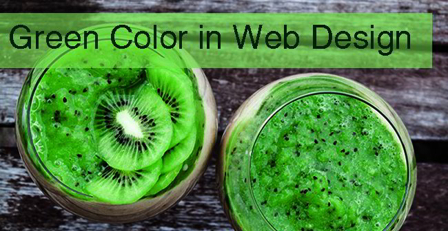
Take green, for example. Green is one of the more common colors used in web design. But there is more to green than just being an attractive hue.
The Different Meanings of Green
Colors have meanings and connotations, and green is no exception to this rule. Here are some of the ways that people can react to the color green in your web design:
It brings the environment to mind. Environmentalism is often called the “green” movement, and many environmental websites emphasize this by featuring the color green predominantly in their websites. Green is the color of fresh and healthy leaves, and as such it projects a feeling of the outdoors.
Green can really grab people’s attention, although in a rather subtle and understated way. It works as a highlight color and it’s great for CTA (call to action) purposes. Highlighting text with the green color illuminates it nicely without being too demanding. You can still see the text clearly. It’s readable, and it’s not annoying to look at. It feels cool and relaxed. It’s like saying “Look at me!” without a lot of excessive arm movements. In addition, it is also often used to direct the reader to the button that a website wants them to click. Some website designers have reported that this color has had the most success in encouraging website visitors to click on something. If you have a button for a visitor to click on, use a green button as a way to encourage them to do so. It plays on how green means “go” in traffic lights. It gives your site visitor the feeling that following what you are telling them to do is actually safe and good for them.
Because it is a very natural color, it also means wellness and health. It denotes safety and security. It’s actually been found that green soothes the eye and the nervous system, and it can lower your blood pressure. It calms your nerves and decreases your frustration and anger. This isn’t just supposition or conjecture; scientific studies have actually confirmed this as a fact. So if your product centers on “natural supplements” or health products, you may want to use green a lot. People will associate your product with being healthy and safe, and natural as well.
Green is also the color of money, and in combination with its “security” meaning, it implies sound financial health. This is why many banking and financial advice websites use this color. After all, people can be very anxious about the state of their finances, and the color green works on two fronts. It implies that money is the topic. But it also exudes coolness and calm that
helps people feel less afraid and more secure. By using green way this, you give the impression that their money will grow in healthy ways, and that it won’t be lost in foolish ventures. It’s absolutely safe and secure.
Shades of Green
There are of course different shades of green, and each shade has its own particular associations:
- Dark green. This is often the shade used when money is an important factor. It denotes power and prestige, which is why many corporate websites use this color. It feels conservative and straight. It is also serious, and implies it has no time for jokes and fooling around.
- Bright green. This color is active and lively, which makes it perfect for energetic environmental websites. It feels very much alive, and the sheen is a testament to its unbridled energy. This is the color for people with a determined sense of purpose. Coupled with the environmental movement, it’s for people who are really serious about doing something for the environment.
- Pale green. You see this color often in Oriental art, and it demonstrates a sort of quiet and serene elegance. The calm it displays is very soothing, and quiet
- Yellow-green. This may be seen on health product websites, as it somehow implies weakness and sickness.
- Olive green. This, on the face of it, can be very relaxing and peaceful. Yet for some, it may denote the military.
- Blue green. This shade is perhaps the most appealing shade of green. Both men and women are attracted to this shade, as it is very pleasant to look at. Look at it this way: lots of people like this hue and very few people dislike it. It’s a color that embraces everyone.
If you want your website to be cool, light, and natural, with a touch of purpose and elegance, as well as security and peace of mind, green is the color to use.
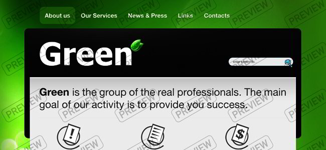
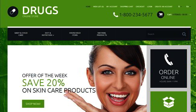
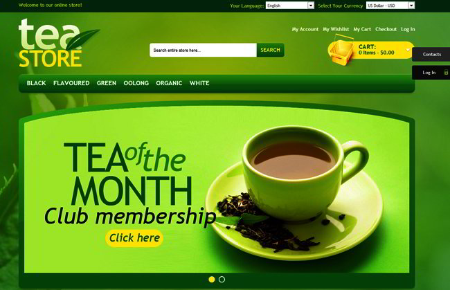
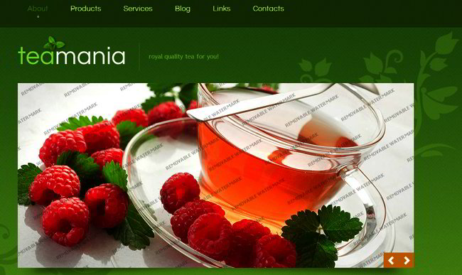
Here are some perfect examples of green color used in website templates: