What You Need to Know About Responsive Design
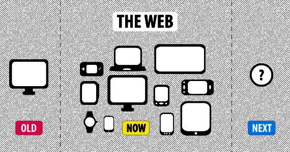
Responsive design has been around since 2010 and has changed the standards for web design. Responsive design is everywhere! Do you browse the web on a tablet or smartphone? If you have than you are seeing the wonders of responsive design at work.
Some books about Responsive web design:
- Responsive Web Design (Brief Books for People Who Make Websites)
- Responsive Web Design with HTML5 and CSS3
- Implementing Responsive Design: Building sites for an anywhere, everywhere web
- Responsive Design Workflow
- Quick Guide How To Get Your Site Ready For Every Device And Browser
- Responsive Web Design by Example
- Getting The New Baseline In Web Design Right
- Responsive Web Design Overview For Beginners
According to a study by Pew Internet, 55% of Americans claimed they were using mobile devices for internet access in 2012. Even more astonishing is that 31% of them said it was their primary method of browsing the web.
Let’s put it this way. If you’re not using responsive design you’re missing out! Interested in knowing more? Read on..
What is responsive design?
First let’s look at what responsive design isn’t. It isn’t static and conformed to definite pixels. Responsive design doesn’t look bad on mobile devices. At its core you could define responsive design as design that responds to the users screen resolution and re-arranges the design in such a way that good user experience is maintained.
Here’s some homework. Go ahead and browse to your favorite website on your computer you’re using right now. See how it looks? Now pull up that same website on your smartphone or tablet. There is a good chance that the website you decided to visit is responsive. The easiest way to know is if the design looks different -but in a good way. The design should have re-arranged the page elements in such a way that you can still easily read the content.
Hold up! Responsive design isn’t the same thing as ‘mobile friendly’. A common misconception is that mobile friendly design is the exact same thing as responsive design. It isn’t -so just get that out of your head right now! Mobile friendly design is when you have to actually create two different versions of the same website. If a user browses your site on a mobile device one design is served up to them. Same user can visit your website on a desktop or laptop and a completely different version is delivered. That’s just way more work that what’s needed, wouldn’t you agree? With responsive design you create it once. The browser handles the rest. Score!
How grids, typefaces, & images affect responsive design
Here’s how responsive design works. You can think of a web design in terms of grids and columns. It’s usually good to start with a set maximum width for the layout, we’ll use 1024px since it fits most monitors.
Your design is then split into a specific number of columns. Typically you go in groups of four; so popular column amounts would be 4, 8, 12, & 16. The amount of columns is entirely up to you.
Each element of your design is then given proportional widths and heights instead of old pixel defined dimensions. This is where the fluid columns and responsiveness comes in. Since you have a pre-defined max width and set columns, the elements will automatically adjust their dimensions depending on the users screen resolution. Smart, right?
The same standards go for typefaces and images. Instead of fonts being set sizes in pixels, you use a measurement called rem. With images you typically use a script such as Picturefill that uses JavaScript to re-size the images accordingly.
Don’t be afraid to use responsive frameworks.
Ever heard the saying, “Don’t re-invent the wheel”? You should consider this with your next responsive design work. There are several popular responsive frameworks, such as the Twitter Bootstrap, that can make your life so much easier! These frameworks have already set the columns and common design features for you. Using frameworks means you can spend more time on design and less time coding.
Don’t forget about email design!
Did you know that email newsletters can be responsive as well? More and more people are reading their email on their tablets and smartphones -you need to be ready! There are several good frameworks that offer email options.
Your turn!
We would love to hear your thoughts on responsive design. Have you ran into some unique challenges while trying to configure your CSS? Leave a comment below.
Related Posts:
- Responsive Design Books for Smarter Design
- 40+ Best Responsive Design Tutorials
- Secrets of Responsive Web Design
- How to Create Responsive WordPress Web Design?
ABOUT THE AUTHOR